Connections between redlining, segregation, gentrification, displacement, migration, and affordable housing continue to dominate our research about how old boundaries may still separate our neighborhoods and how our urban areas can better serve and nurture all of their residents and workers. Skyrocketing housing prices have further energized these debates. You can see why we have addressed these topics in previous stories on this web site and within our publication.
Recently, developing geospatial technologies have revolutionized how we research these issues, trends, and problems. New maps join our old maps to inform and encourage us to view our cities and neighborhoods through clearer lenses and with fresh perspectives that we could only have imagined years ago. In this story, we have selected a few recent sources shared by geographers Jing Liu, Pete Morris, and Rob O’Keefe.
The tsunami of data and maps that are being reexamined and produced for us to peruse and interpret can be overwhelming, so we will try to narrow our sources to a handful of recent projects and organizations whose efforts can be tied together. This is an exceptional story for our web site since we are not so much interpreting or analyzing the data here. Instead, we are sharing the work of other researchers and scholars by linking you to several sites that might help all of us understand how our neighborhoods and cities are evolving with their own histories of successes and failures. Our story ends with a short photo essay.
We will remind you to be careful about oversimplifying and accepting popular interpretations of these maps and studies. Our cities are as complicated as the people who work and live in them. We have been forced to reconsider and adjust some formerly accepted theories and assumptions about how they evolve and change. We must admit that future researchers may discredit some of today’s popular theories, assumptions, and overgeneralizations about how past landscapes, people, and policies might explain what we see today.
Ours are perplexing urban landscapes of sequent occupance, continually remodeled by countless forces that we struggle to understand. Cities and neighborhoods we see today are products of the past, but they also reflect our recent decisions and policies, requiring us to accept responsibility for them. When wearing his historical geographer cap, Pete Morris correctly warns us about the rhetorical power of maps, especially when they use color-coded jargon to support popular belief systems. We should also be careful to make what may first seem to be convenient links between past and current urban geographies when such relationships may be much more complicated. In other words, more cautious micro-scale analyses might challenge assumptions we have manufactured from overgeneralized maps that may have supported our presumptions.
With these cautionary thoughts, we invite you to use the following links to expand your knowledge of how redlining, segregation, gentrification, migration, displacement, and affordable housing might leave their imprints on California’s urban people and landscapes. You are encouraged to construct your own informed interpretations while pondering each of the following outside sources.
This educational video traces the historic policies that set the foundations for today’s conflicts over gentrification. Though it is intended for a nationwide audience and discussion, neighborhoods in Los Angeles and San Francisco are highlighted, especially toward the end; it was produced by the UC Berkeley Urban Displacement Project, Federal Reserve Bank of San Francisco, and Great Communities Collaborative, an Initiative of the San Francisco Foundation: https://www.youtube.com/watch?v=V0zAvlmzDFc
Consider San Francisco’s Legacy of Redlining, produced by the UC Berkeley Center for Community Innovation at the Urban Displacement Project:
https://www.urbandisplacement.org/redlining
Here is a more detailed map from the Urban Displacement Project showing gentrification, displacement, and exclusion in the Bay Area, but with a rich choice of relevant layers to add:
https://www.urbandisplacement.org/san-francisco/sf-bay-area-gentrification-and-displacement
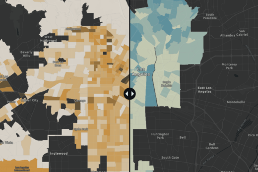
This more detailed map from the Urban Displacement Project covers southern California’s most populated coastal counties: Mapping Neighborhood Change in Southern California: Los Angeles, Orange, and San Diego Counties: https://www.urbandisplacement.org/los-angeles/los-angeles-gentrification-and-displacement
ESRI has published a wealth of redlining and gentrification maps that cover the Bay Area with thorough explanations and interpretations. (A few may require sign in to ArcGIS online):
https://www.arcgis.com/apps/MapJournal/index.html?appid=1832f7860d634b83877475144748908e
Don’t miss the series of seven ESRI Bay Area diversity maps (from above) that illustrate how the percentage of whites in the population has changed since 1920; watch on their page 6 as neighborhoods evolve with their redlining and gentrification imprints.
You will find redlining maps and detailed neighborhood descriptions and data from the 1930s for Sacramento, Stockton, Oakland, San Francisco, San Jose, Fresno, Los Angeles, and San Diego at Mapping Inequality: Redlining in New Deal in America. Simply click on one of the California cities at
https://dsl.richmond.edu/panorama/redlining/#loc=6/36.43/-121.553
However, you might want to read through the introduction that describes the Home Owners’ Loan Corporation (HOLC), their grading criteria, and the time frame: https://dsl.richmond.edu/panorama/redlining/#loc=6/36.752/-119.861&text=intro
Here is a KQED article about attempts to recover from redlining, focusing on Oakland’s Fruitvale neighborhood:
https://www.kqed.org/news/11648307/has-oaklands-fruitvale-neighborhood-recovered-from-redlining
Gentrification and displacement were impacting California’s people and cities long before researchers were using scholarly terms to describe these trends. This remarkable video about Bunker Hill in 1956 examines the struggles of another vulnerable and relatively powerless (mainly elderly) population in a thoroughly segregated Los Angeles. Interestingly, it was filmed just after the nearby working-class Mexican American neighborhood in Chavez Ravine had been acquired by the city through eminent domain. Dodger Stadium would soon rise to replace that ravine and its neighborhood in a saga that would be remembered as one of the most controversial and debated displacements of an entire community in the city’s history. Back on that languishing old Bunker Hill in the 1950s, you don’t have to imagine local residents (many retired) watering their lawns, visiting neighborhood bars, and shopping at Angel’s Flight Pharmacy on yesterday’s relatively sleepy hill; in this film, they are threatened with displacement just more than 60 years ago. If today’s collection of steel and glass skyscrapers representing the center of a world-class super city was the developers’ intention…mission accomplished: https://vimeo.com/332916635
You can find many stories about how the growth of L.A. Airport encouraged or forced displacements in surrounding neighborhoods during past decades, as flight patterns rendered them unlivable. Here is a more recent video highlighting such transitions and displacements, this time in Manchester Square, at the hands of L.A. World Airports: https://www.youtube.com/watch?v=BhNLQKHYjXk
Exploring some California Examples
The following photos will take us into the field to apply some of the concepts and observe some of the trends we have explored in this story.


We end our story with just one more image from just one more San Francisco district that evolved from despair to stardom in recent decades.

A Portion of South of Market becomes The East Cut
By the late 1800s, this once up-scale San Francisco neighborhood had declined and “lost its cachet”, becoming a “gritty swath of industry and commerce.” Following the 1906 earthquake, it was described as “warehouses and large business operations catering to seafaring and other industries”. Such descriptions carried through the decades until signs of change began to sprout in the late 1900s. Boosters eventually broke traditional links to its South of Market past and some of its working-class neighbors. By the 21st Century, it was being remade into a high priced mixed-use neighborhood in high demand. It is now (rebranded as “the East Cut”) home to The City’s tallest skyscraper, just a short walk from this intersection. Note how the language used by today’s developers and boosters sounds similar to movements that have been gentrifying neighborhoods in cities across California:
“The East Cut is San Francisco’s fastest-growing and most exciting new neighborhood. For years prior to its rebirth, our area was lumped in with SOMA, South Park, South Beach, the Financial District, or the Embarcadero. But as our neighborhood has redeveloped and come into its own, residents, businesses, and community organizations are embracing a new identity to distinguish our home from the rest of the City.”
“This unique part of San Francisco has experienced significant change and growth in the past few decades, including the removal of the Embarcadero Freeway, the most dense concentration of new home construction in the Bay Area, and the creation of thousands of new jobs. The East Cut is a local effort to unite the Rincon Hill, Folsom Street, and Transbay areas under a new banner and identity befitting our neighborhood. While building a sense of place and pride today, the East Cut also harkens back to a time when our community was an indelible part of San Francisco.”
https://www.theeastcut.org/about-us/
