In this story that has necessarily expanded with unfortunate current events, you are invited to compare the following maps that illustrate how education, ethnicity, and politics combine to mold the human geography of our state. Our population of about 40 million people has had no ethnic majority for many years. Sailing through 2020, Hispanic Californians are now the plurality at about 39%, closely followed by White Californians (~37%), then Asians and Pacific Islanders (~15%), African Americans (~6%), those identifying as Multiracial (~2%), and Native Americans (<1%). You can find plenty more details about our historic trailblazing experiment in diversity from the California Department of Finance and our publication.
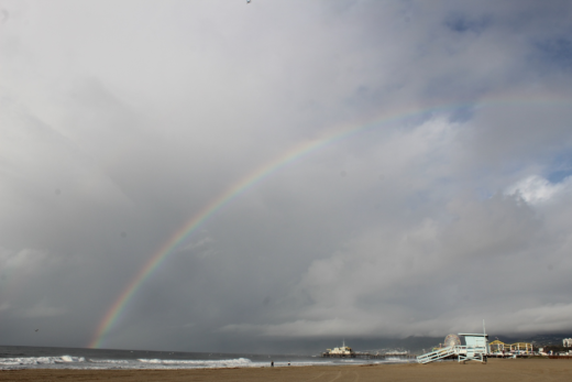
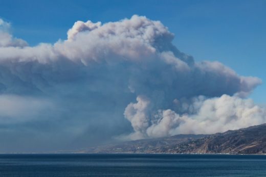
Will 2020 go down in history as the taxing year that broke California or the year when we met unprecedented challenges that forced us to make necessary changes and paved our way toward a brighter future? Can such a heartbreaking year of disease, distrust, and divisions be turned into the year when we discovered how to make positive change, when we celebrated our diversity and strengthened our connections that have been highlighted throughout this project? Those who might have previously questioned why we sometimes wandered into analyzing these struggles, conflicts, and controversies that trouble us aren’t asking any more in this year of reckoning. These lessons in human geography help us understand why each of us must accept personal responsibility for resisting or following those who have lost their moral compass, the selfish opportunists who exploit our divisions by creating more victims, enabling behavior that could leave us spiraling into a dystopian future.
The dragon that threatens us feeds on ignorance that digests into the putrid hate, stereotyping, fear, and discrimination that can poison our state and its people and its leaders. We must be armed with knowledge to slay this dragon. And so we offer plenty of information in this story and this project that might help speak truth to power and to those who might abuse it and to empower those who might not have it. Here, we will again take the higher road toward a brighter future that starts by using the knowledge that liberates us. In our never-ending efforts to encourage researchers with different perspectives who can add to the wealth of evidence that informs us about the Golden State, Bill Bowen will make his contribution with maps. We can slay the dragon by learning from such geographers and related influencers with their diverse expertise.

He is a native of where the Sacramento Valley spills into the Delta. He earned his PhD studying with renowned geographers during the exciting growth years at a storied institution: UC Berkeley. He migrated to southern California to build a family and a long, distinguished career as a leading geographer at California State University, Northridge. Today, he remains very active, years after finally returning to the other side of Sacramento with his family, proving how geographers can make notable and lasting contributions long after “retirement”. Bill Bowen continues to be an impactful influencer, by refining and applying his geospatial technology skills, and using them to produce impressive and informative maps that shed more light on our Golden State. We thank him for contributing substance to our project through the years and for sharing some of his latest creations.
We start with two images Bowen captured from the air back in the autumn of 2016. They demonstrate how a geographer can look down on his home with a clearer lens that reveals fascinating patterns; these are the detailed imprints on our landscapes that unveil secrets about the physical and human systems and cycles that rule our world. The first image (above) displays how agricultural patterns and activities still dominate so much of the Sacramento Valley and how farmers use prescribed burns (on allowed burn days dictated by air quality) to remove crop residues such as hay and rice and to better control weeds, pests, and diseases. It reminds us how the Sacramento Valley plays a key role in making California the leading agricultural state, still without a close rival.

The second image (above) looks east and upstream along the Yuba River as it flows out of the Sierra Nevada foothills east of Yuba City. You can see imprints left behind from 170 years of mining and water management that have altered the Yuba River drainage basin’s natural hydraulic and sediment transfer systems. You can also see the maze-like dredge tailings, known as the Gold Fields, reminding us of the historic Gold Rush that changed California forever. This basin is now being reimagined and reengineered with long overdue 100-year flood protection and ecosystem restoration projects. The purpose is to block and control flows that can then be diverted or percolated into local aquifers, while protecting endangered migratory birds and fish. Dantoni, Marigold, Hammonton, Timbuctoo, and Sucker Flat are just a few of the colorful historic place names along this river basin that most people never thought of as Californian, places with histories, cultures, and landscapes pretending they could be thousands of miles away from the state’s powerful coastal cities.
Next we turn our attention to the informative maps that Bowen has recently produced, demonstrating how GIS has transformed the way we make maps and examine our state. The first map (above) unveils political divisions that we have frequently addressed in our publication and on this web site. It reminds us of Rob O’Keefe’s county map in our publication, where he displayed presidential election results from 2016. Bowen’s points map clearly paints those two Californias and the transition between them. Democrats dominate in most coastal cities, but less so as we move inland and into more distant suburbs. The farther we travel into more remote rural inland communities, the more Republicans tend to dominate the electorate, with some notable exceptions.

The next map (above) shows the percentage of adult Californians at each location who have NOT graduated from high school. Note that, in and near most coastal cities, less than 3% of adults have not graduated from high school. But that number dramatically increases to more than 21% as we move inland into rural communities where primary industries (such as farming) dominate. Specifically, the Central Valley, Imperial Valley, and Salinas Valley stand out. These regions are home to high numbers of migrant farm workers and fewer educational opportunities. The contrasts between highly-educated populations concentrated in coastal cities and clusters of less-educated people in rural inland communities is clear. Exceptions can be found within a few low-income neighborhoods in some cities that house pockets of less-educated service workers. On the other extreme of exceptions are the occasional clusters of inland communities that have attracted retirees or other more educated Californians escaping from crowded cities into resorts and communities surrounded by nature and open spaces, such as in the Sierra Nevada foothills.

Percent of College Graduates in North/Central California. Places with large percentages of college graduates tend to be in and around coastal cities (dark green represents nearly 1/3 or higher), and along some suburban transportation corridors, such as those extending northeast of Sacramento. Very small percentages of populations living in rural, inland, and especially farming communities have earned college degrees (deep reds near 6% or less).
California’s patterns of polarized politics, cultures, and economies are evident on these maps. For instance, Berkeley (where there are 24 Democrats to every Republican) stands out in Bowen’s political map. (The other top Democratic strongholds are an interesting mix of both upper income white and lower income communities with people of color in the Bay and L.A. areas.) The cultural connections are fascinating. For instance, in the annual Niche rankings that are based on what are considered rigorous analysis of data and reviews, Berkeley consistently leads as one of the top ten best places to live in America, including the best suburb and healthiest city. Recently, Apartment Guide ranked Berkeley as the top coffee city in the country, with the greatest number of coffee shops and cafes specializing in coffees and teas/capita (1/2,073 residents). San Francisco ranked third in the nation in the same coffee study. And it is no surprise that the state’s wealthy coastal communities (such as in Marin County, with its high percentage of graduate degrees) consistently rank highest in educational attainment AND cost of living surveys. Follow along to examine the two Californias.
These communities with high numbers of students, professors, and highly-skilled professionals (such as the Silicon Valley and southern California’s Silicon Beach and Tech Coast) stand out in contrast to lowest-ranked communities that are usually found far inland, where primary industries with their less skilled work forces dominate economies, cultures, and landscapes and where the cost of living is relatively low. Central Valley or Inland Empire cities often place on worst places to live lists (such as research published in 24/7), where surveys find some of the least healthy residents with the highest poverty rates and lowest educational attainment. There are plenty of Californians who live in cities, suburbs, and remote inland locations who would take exception to what might be considered unfair over-generalizations and stereotypes here. Our state has 40 million different perceptions and definitions of happiness and quality of life and even more ways of measuring them. But that doesn’t dismiss the power of these maps and what we can learn from them.

Notice the striking general similarities between trends in northern/central California and southern California. Dominant greens show highly educated populations along the coasts, trending to a more varied mix into the suburbs, especially locations that could be perceived to be within commuter distance of major cities. As we move farther inland, we become more detached from the coastal cities until the reds of large percentages of people without college degrees may dominate.
Combine all of these maps and you can see many different variations and methods of measuring and defining the two Californias. According to studies in publications such as Education, people with advanced graduate degrees earn 3.7 times more than those who have not completed high school. These highly educated people tend to settle in and near major metropolitan areas with corporate headquarters and the best jobs. We can now add ethnic groups into the mix. Compare these with the previous maps to better understand which communities thrive with highly educated populations and which communities struggle without education and other resources, yet more ways to define and measure the two Californias.


How might you use the information in this story to respond to the challenges that have erupted during 2020? As I write this, the symptoms of the disease are all around us. They come in the form of the Public Safety Alerts that blare out of our phones to announce the latest curfew, the constant whine of sirens from responders trying to quell the violence, and the ominous presence of National Guard forces that have settled on our city streets. The symptoms are also evident in the senseless violence that left the detritus of destroyed businesses and public property in our downtown that will cost us millions of dollars to restore. In the middle of this chaos, one of the more poignant and common graffiti read, Eye for an Eye, an unintended and somewhat ironic reminder of how we continue to act in ignorance as if we were all blind. So, it is hoped that some of the information here might encourage us to use our intelligence that will help cure our disease and build a road toward the light. Knowing “where” is just a start.

The next logical step is to add to the impressive research and analyses that help us understand these patterns we observe. Historical institutionalized discrimination, segregation, racial restrictive covenants, redlining, white flight, migrations, growing gaps between working- and upper-classes, gentrification, access to and defunding of public education, tribalism, growth of new ethnic enclaves, job opportunities for highly-skilled and less-skilled workers, affordable housing and cost of living, access to health care and other services, commute times, and perceptions of living standards are part of a much longer list of multiple variables to be studied. Environmental considerations such as topography, microclimates, exposure to pollution, access to open space and natural resources, natural hazards risks, and related quality of life variables also help explain these maps since these factors are perceived very differently by diverse groups when they are forced to decide where to live. Many of these variables can be mapped and layered to help us understand what are otherwise extremely complicated human behaviors, decisions, and patterns on the land. Such research will help us solve the problems that confront us in 2020 and beyond as we more effectively address the issues we have tackled in this project and in our publication.

Start with a wealth of practical and research experiences, add astute and perceptive landscape appreciation, throw in some good geospatial technology skills, and you have created some impactful geography with powerful influence potential that can change the world. Now, it’s your turn.